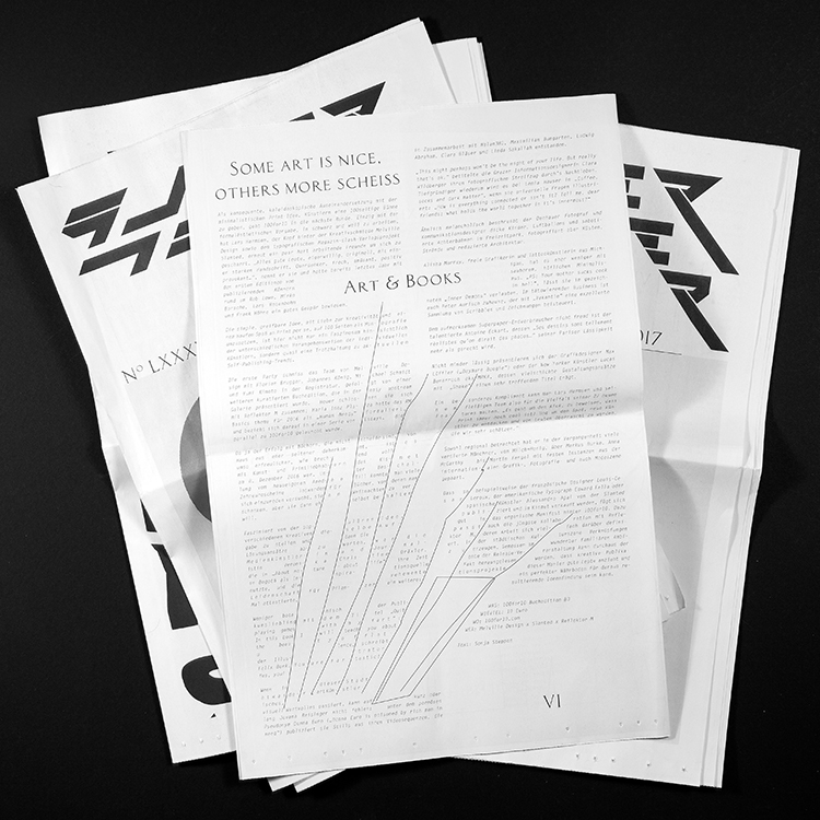
superpaper issue #87 about 100FOR10
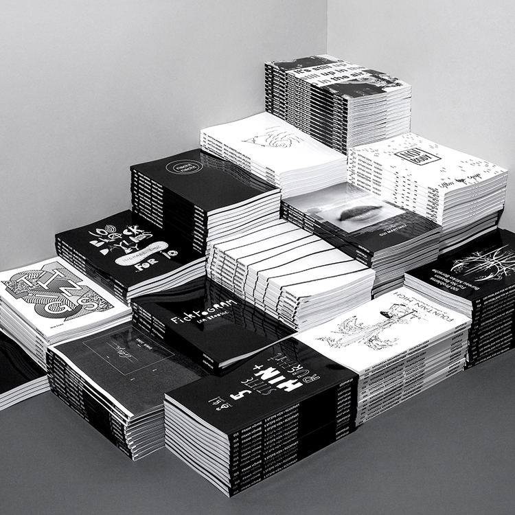
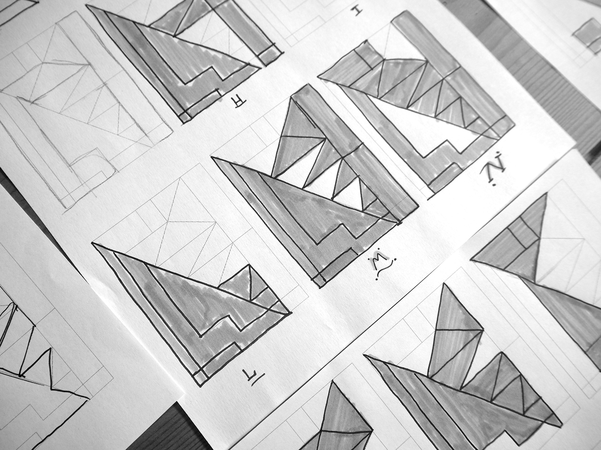
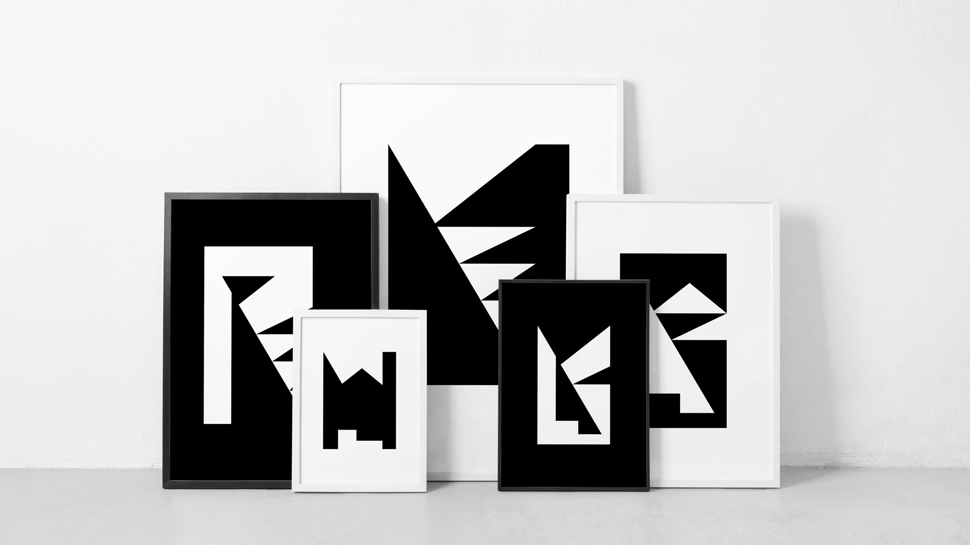
Als konsequente, kaleidoskopische Auseinandersetzung mit der minimalistischen Print-Idee, Künstlern eine 100seitige Bühne zu geben, geht 100for10 in die nächste Runde.

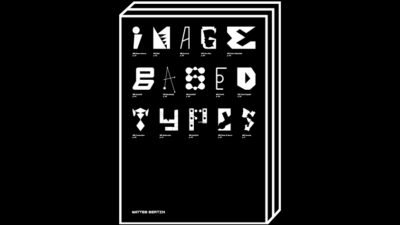
Matteo Bertin
Edition No. 118
Als konsequente, kaleidoskopische Auseinandersetzung mit der minimalistischen Print-Idee, Künstlern eine 100seitige Bühne zu geben, geht 100for10 in die nächste Runde.